UI Components
Ionic apps are made of high-level building blocks called Components, which allow you to quickly construct the UI for your app. Ionic comes stock with a number of components, including cards, lists, and tabs. Once you’re familiar with the basics, refer to the API Index for a complete list of each component and sub-component.
Action Sheets display a set of options with the ability to confirm or cancel an action.
Alerts are a great way to offer the user the ability to choose a specific action or list of actions.
Badges are a small component that typically communicate a numerical value to the user.
Buttons let your users take action. They're an essential way to interact with and navigate through an app.
Cards are a great way to display an important piece of content, and can contain images, buttons, text, and more.
Checkboxes can be used to let the user know they need to make a binary decision.
Chips are a compact way to display data or actions.
Content is the quintessential way to interact with and navigate through an app.
Date & time pickers are used to present an interface that makes it easy for users to select dates and times.
Floating action buttons are circular buttons that perform a primary action on a screen.
Beautifully designed icons for use in web, iOS, Android, and desktop apps.
The grid is a powerful mobile-first system for building custom layouts.
Infinite scroll allows you to load new data as the user scrolls through your app.
Inputs provides a way for users to enter data in your app.
Items are an all-purpose UI container that can be used as part of a list.
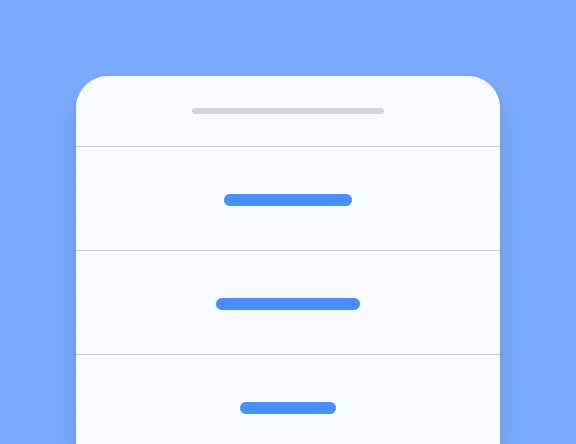
Lists can display rows of information, such as a contact list, playlist, or menu.
Navigation is how users move between different pages in your app.
Menus are a common navigation pattern. They can be permanently on-screen, or revealed when needed.
Modals slide in and off screen to display a temporary UI and are often used for login or sign-up pages.
Popover provides an easy way to present information or options without changing contexts.
Progress indicators visualize the progression of an operation or activity.
Radio inputs allow you to present a set of exclusive options.
Refresher provides pull-to-refresh functionality on a content component.
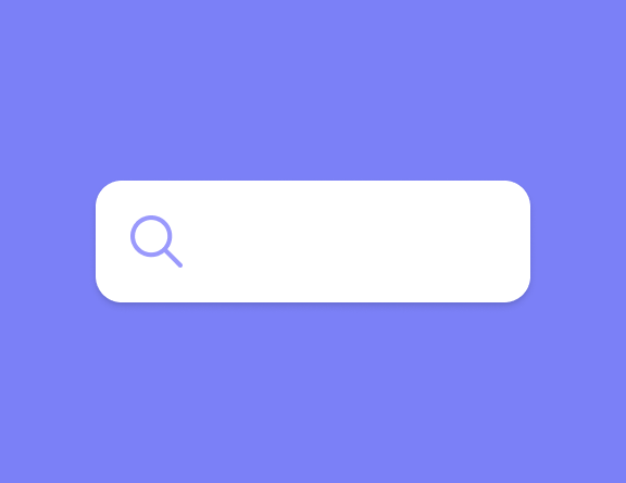
Searchbar is used to search or filter items, usually from a toolbar.
Reorder lets users drag and drop to reorder a list of items.
Routing allows navigation based on the current path.
Segments provide a set of exclusive buttons that can be used as a filter or view switcher.
Select is similar to the native HTML select, with a few improvements to sorting and selecting.
Slides make it easy to create complex UI such as galleries, tutorials, and page-based layouts.
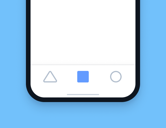
Tabs enable tabbed navigation, a standard navigation pattern in modern apps.
Toast is used to show a notification over the top of an app's content. It can be temporary or dismissable.
Toggles are an input for binary options, often used for options and switches.
Toolbars are used to house information and actions relating to your app.